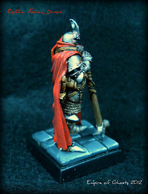
I'm not one to re-do posts but the prior pics really annoyed me. So I toyed and toyed with re-taking pics of this mini, and the following is the best of the worst. Again, the red appears much too bright than its actual shade in real-life and it's very hard to get a sense of the shading up from purple through deep red and on to bright red throughout the cape itself. This seriously bugs me because, for the first time, I really felt like I've captured a realistic shading of red and my camera....just won't take a clear photo with blowing the luminosity of the red through the roof!
FINALLY!
Pro-tip: White balance and indirect lighting are your friends. I believe that, with my model of camera, this is about as good as it's going to get and it's about 98% true to life.
Special thanks to generalpoleaxe at Lead Adventure and the Redditors on /r/minipainting for the useful tips!
Pro-tip: White balance and indirect lighting are your friends. I believe that, with my model of camera, this is about as good as it's going to get and it's about 98% true to life.
Special thanks to generalpoleaxe at Lead Adventure and the Redditors on /r/minipainting for the useful tips!


1 comment:
Loving that red! So vibrant and not flat at all!
Subtle weapons and natural pose - good choice!
Post a Comment